
Is a Krylon paint job which is photogenic but also effective even possible?
Well, I can try.
Airsoft is a hobby where a large proportion of activities take place online. That’s not exceptional nowadays. Many hobbies are now split in this way. However, it is worth bearing in mind that for many people the activity of playing airsoft is a minority event compared to the online side of things.
I have the opportunity to play woodland twice a month. Even if I make both day events, I’ll still spend more time chairsofting in any given month than I will playing the game.
How could this tension inform a paint job? Let’s express it with two themes:
- Photogenic (online)
- Disruptive (in game)
Who doesn’t want a paint job that looks right? We all do.
But, if a paint job is to be photogenic it must additionally look good in pics. Looking right and being photogenic aren’t always the same thing. Paint jobs which look right in real time may not always translate well online, during our all important ‘show and tell’ activities.

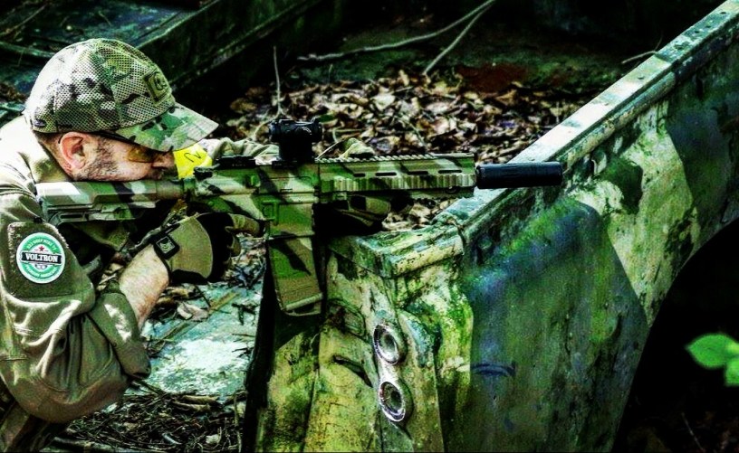
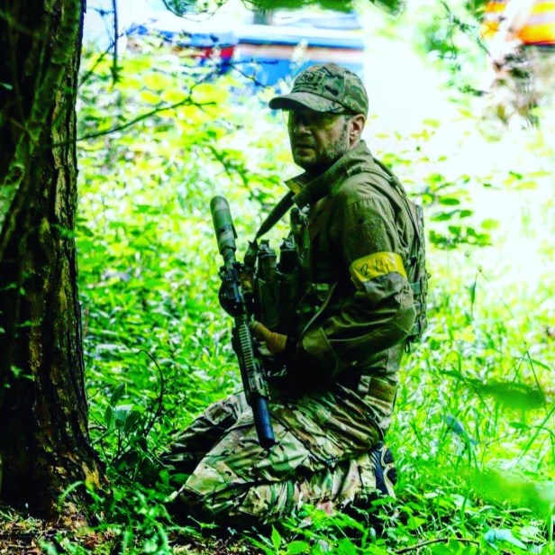
Secondly, for a paint job to be disruptive in the sense I mean here, it must break up the blaster’s outline in woodland. Disruptive paint jobs put out visual interference, so that the eye is tricked.
I’m not saying that a paint job will render a gun invisible. It won’t. However, depending on circumstances, a disruptive paint job may at least trick the observer into thinking an opponent is facing in a different direction (for example). This misperception may buy time for the opponent to take careful aim and get a better shot in. Slow is smooth, smooth is fast, after all. The next thing the observer perceives is a muffled report (the opponent’s blaster is suppressed, naturally) and some BBs winging their way towards them.
That’s the theory, anyway.
Equally, I don’t want to be hiding in a bush, only to be given away by the rather obvious lines of an inorganic, black gun…
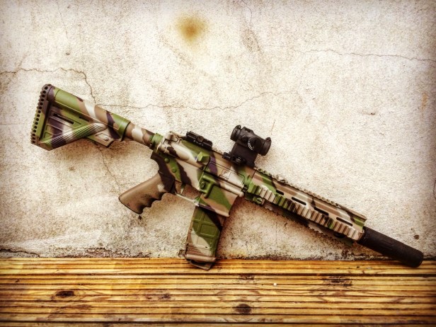
So, the challenge for me lies in combining photogenic and disruptive into one paint job.
I want something that looks good in the pics I’m inevitably going to post online (I need something to blog FFS!) but I also want the paint job to break things up in woodland.
As an aside in Part 1 of this series, I asked the following question as a way of representing my stance on the style of paint jobs I go for. Roughly translated, I’m saying go big or go home:
Do you have the appetite to deliver a completed paint job which maybe looks a bit wrong, predicting that with use it’ll look right? It stays in its used state longer than in its freshly painted one, so why not be a bit bolder with your techniques? Intricate details quickly get lost in the noise, after all. Big, simple patterns just get better with use and, if done properly, will break up the outline of the gun.
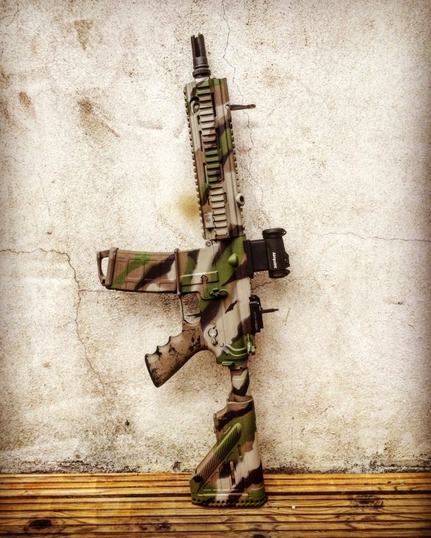
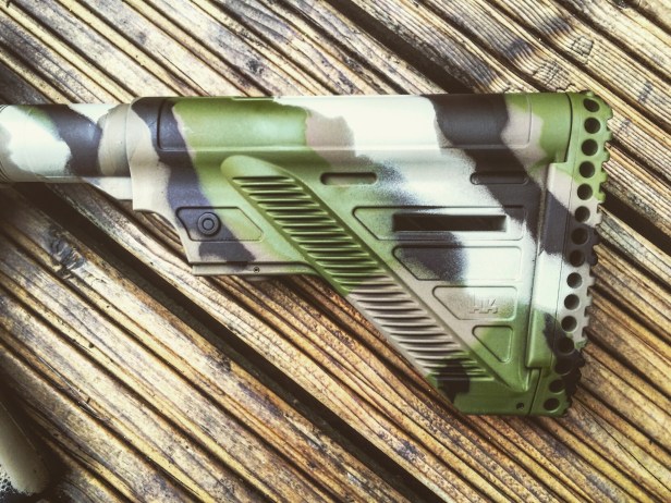
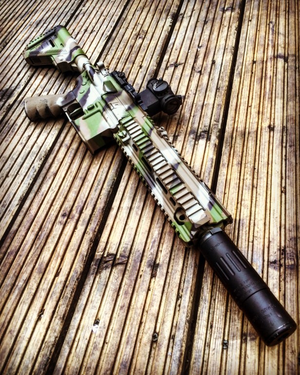
In terms of wrongness, I had a particular green in mind for my new paint job.
Woodland means green – in summer, anyway. The green I wanted to use is quite striking, but I knew that over a short period of time it would tone down. So I always start out bright, because I know the tone will hit the sweet spot in a short period of time; then remain pretty constant throughout the life of the paint job.
In terms of going big, I wanted to include drastic blocks of light and shade for a properly disruptive paint job. It’s the distinctly segmented contrast which tricks the eye. Tonal paint jobs may look great, but they don’t break things up to any great extent.
So, for the green I had in mind, I needed to chose a good base colour.
I’m a big fan of Humbrol Dark Brown 29 as a base and this UK Pathfinders photo session pic from Tankmasters affirmed its currency:
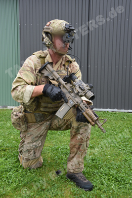
That’s probably the NFM version of Dark Brown 29 in the pic, but the tone is almost identical.
I started experimenting on a spare rail (don’t worry, it was an old VFC one) and came up with this:
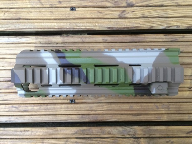
It’s pretty close to what I implemented on my blaster.
How did I intuit the pattern? It’s simply a more organic version of my 2014 splinter paint job:
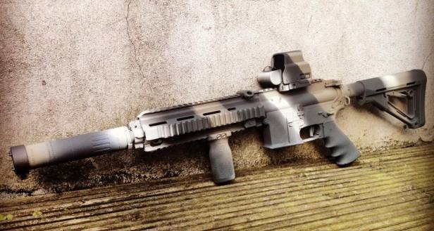
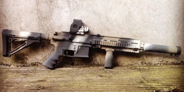
The old paint job looks northern European, but it actually isn’t. The colours were mainly influenced by RAF Harriers in arctic camo. The main influence on the pattern was a British WW1 maritime style known as dazzle.
Aside from the colours and angles, the big difference this time is that I went for wavy lines instead of straight ones.
It’s quite interesting to hear how people interpret this new paint job. I doubt many would realise it was originally based on aeroplanes and ships…if I hadn’t just said it 🙂
I have to say I’m pretty pleased with how things turned out.
Big thanks to Beard for the in game pics, taken at Spartan Airsoft in Bristol.
